
gray 1 |grā| ( Brit. grey)
adjective1. of a color intermediate between black and white, as of ashes or anovercast sky : gray flannel trousers.• (of hair) turning gray or white with age : a gray beard.• (of a person) having gray hair : a gray, fatherly gentleman.• informal relating to old people, esp. when seen as an oppressed group: gray power.• (of the weather) cloudy and dull; without sun : a cold, gray November day.• (of a person’s face) pale, as through tiredness, age, or illness : a few people, their faces gray and bitter.2. dull and nondescript; without interest or character : gray, faceless men |the gray daily routine.3. (of financial or trading activity) not accounted for in official statistics :the gray economy.
Looking at the definition of “gray” one would think it’s the most boring color ever, but the color gray could not be hotter in decor these days.
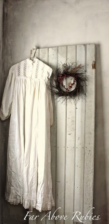

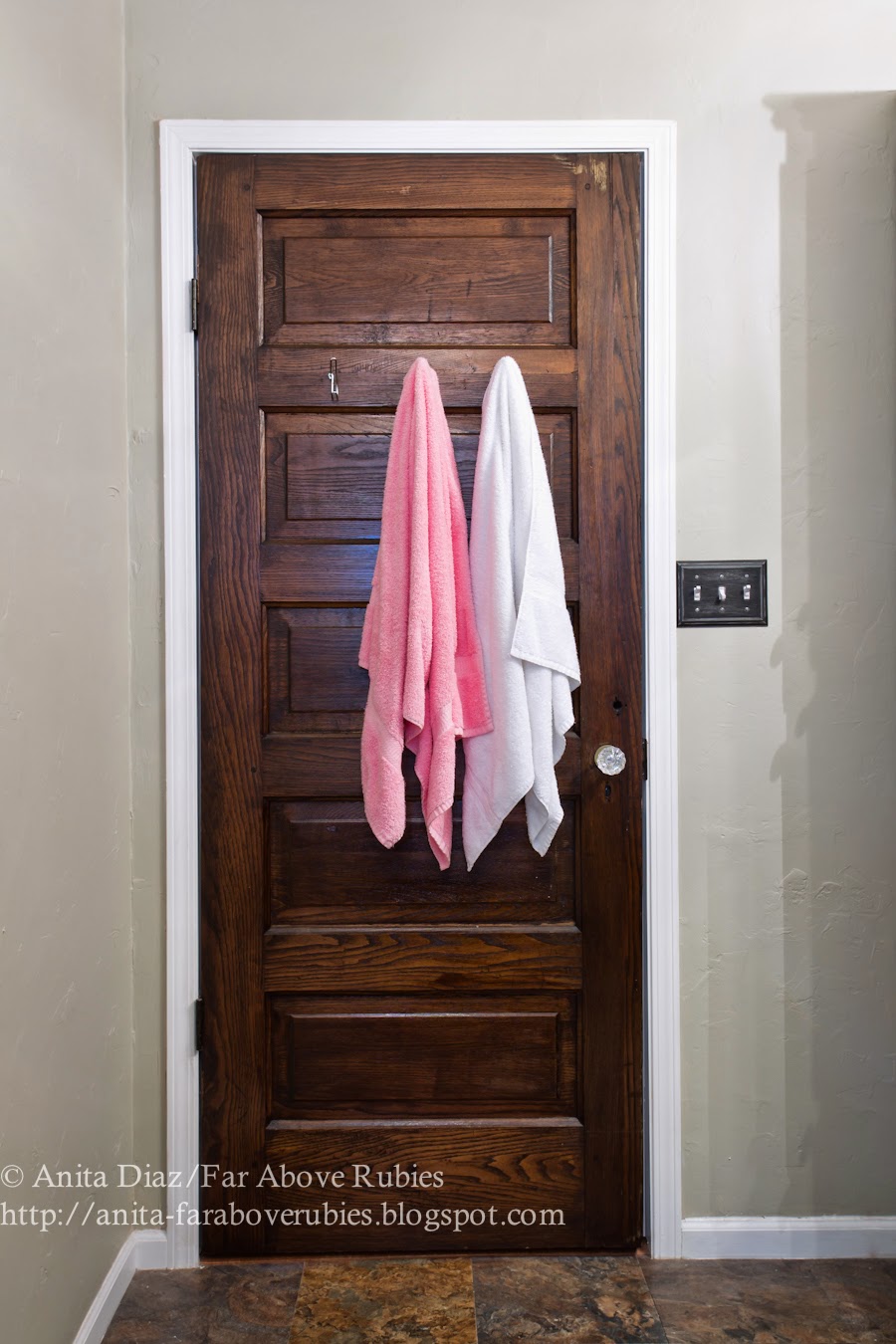
Four years ago, when I finally had enough of the white trim in my house, I started looking for an alternative color to use on said hated trim. I thought about black, but quickly decided that wasn’t for me. After stumbling, literally, into a house full of wood salvaged from my grandparents’ house and another small cottage, I found the perfect color to paint my trim in some beautifully preserved tongue and groove boards. They were gray. My dad told me my grandfather had gallons of “Battleship gray” paint at the store that he apparently used on everything, so maybe that’s what these boards were originally painted. We ended up putting those boards in the hall bath as wainscoting so I knew this was the color I wanted on the rest of the trim.
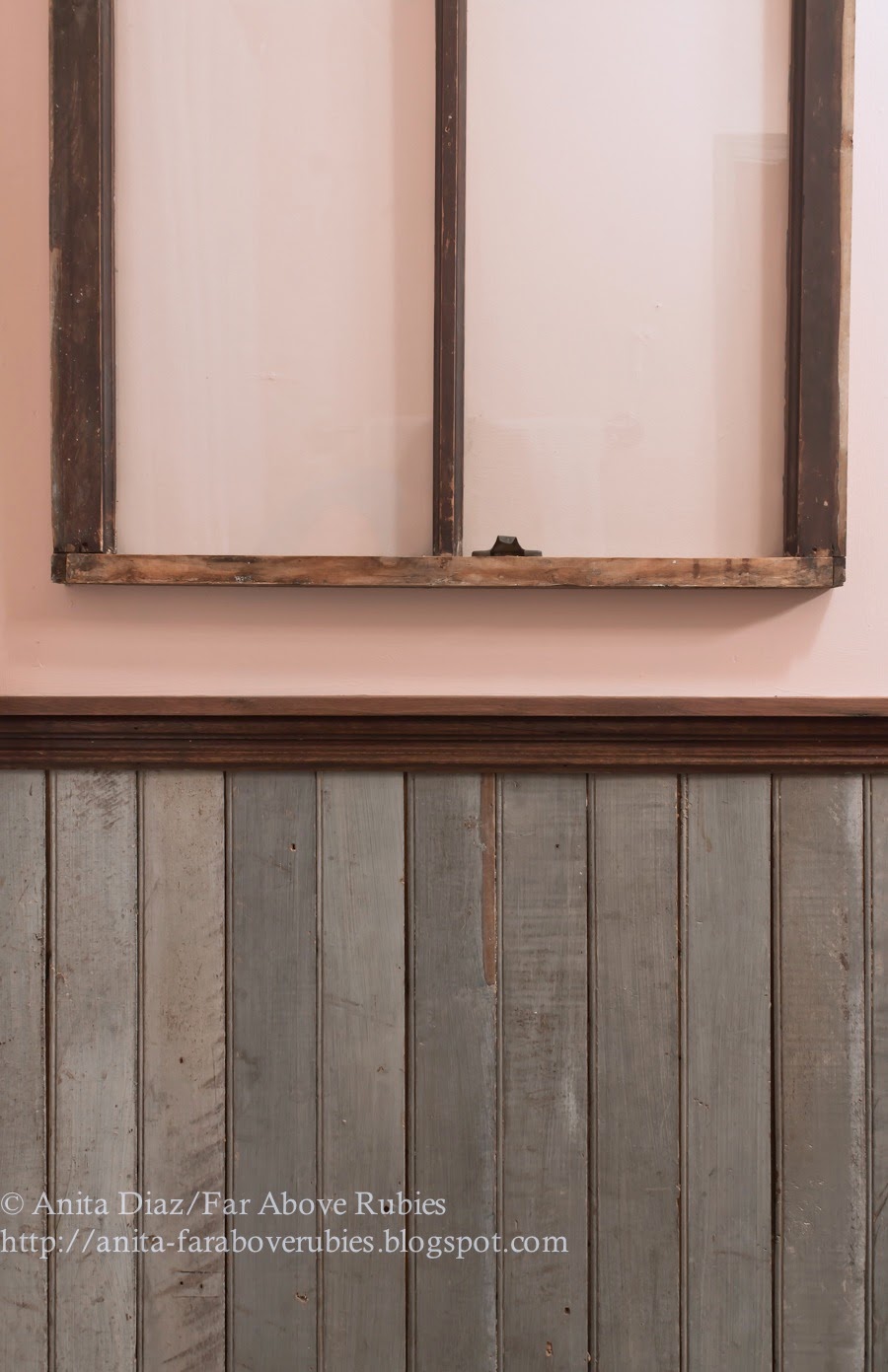
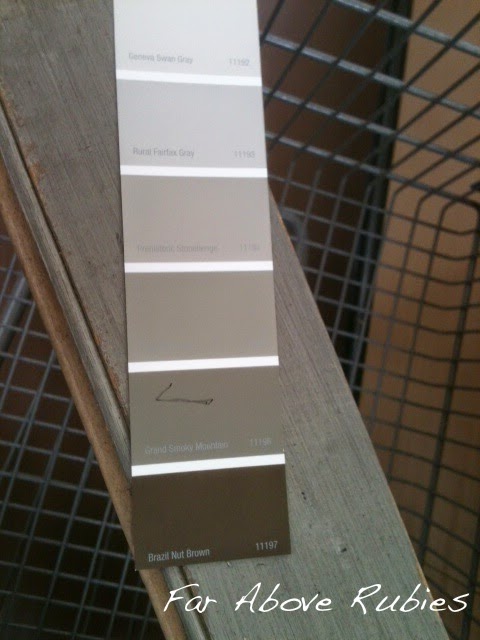
As much as I loved this dark shade of gray, everyone else thought I was crazy, but I persisted. I admit, there were times I thought I was crazy. But not to be deterred, I took one of my prized boards to Walmart (because it’s the only thing close) to have a custom paint color mixed, then just happened to find a shade that matched. “Grand Smoky Mountain” really was a perfect match for the boards I had, so I bought a couple gallons of paint and started painting — first the french doors.
It really made a dramatic difference from the white doors…
(circa 2008)

…to the gray doors.
(circa 2011)

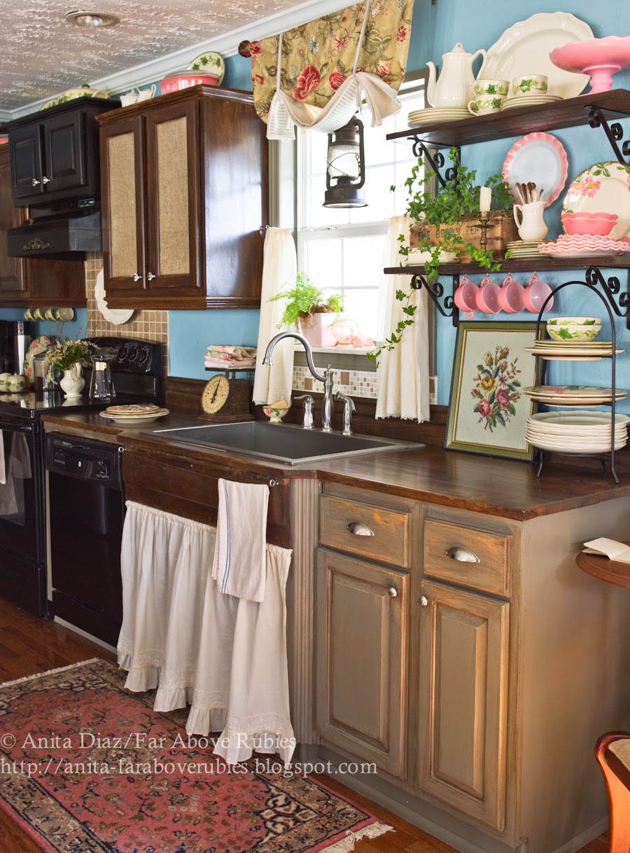
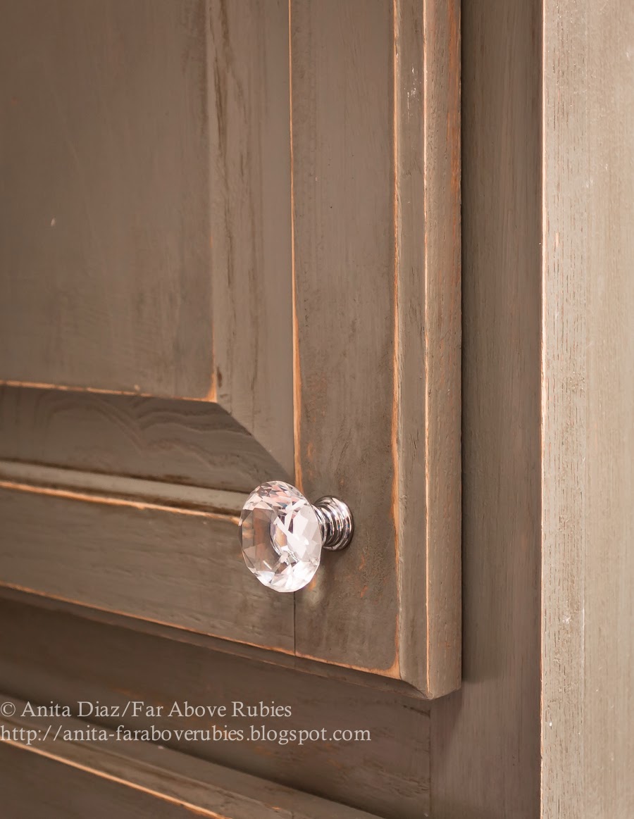
Next, I repurposed an old screen door with the same gray, and the kitchen cabinets soon followed.

I touched up the cabinets last year because I went a little too far on the distressing and glazing the first time, and I just felt they looked dirty.
Next were all the bathroom cabinets.

I painted cabinets, window trim and non-wood doors gray with the intention of replacing all the baseboards with wormy chestnut trim from the old house, but we would have had to replace all the door trim as well to make it all fit, so I just painted all the baseboards gray and left the crown molding white.
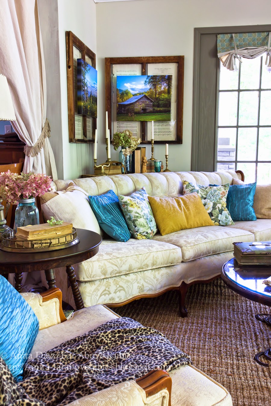
Of course one change leads to another, so I decided to paint the gold living room walls a lighter version of gray and went with “Geneva Swan Gray” from the same paint chip.

I also distressed the walls with a couple different shades of gray to make the walls look like aged plaster.

And I loved that for a while, but I always felt this side of the room just looked dirty.
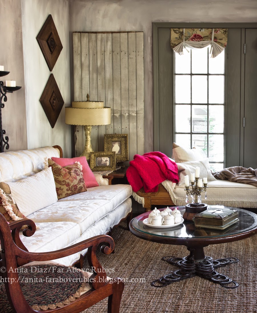
Last fall I couldn’t take it anymore, and finally I repainted with the same “Geneva Swan Gray” and still love how clean and fresh it looks.

When I did the girls’ French-style bedroom last summer, I wanted to use the same color, but it was too warm and just didn’t work in that room. You can see how warm it looks in the middle between the other two grays.

I ended up going with another Colorplace paint from Walmart called “Persian Seed Pearl.” It is a beautifully, cool shade of gray that works really well with the different tones of purple and silver in their room.

For our master bathroom, I also tried “Geneva Swan Gray” but it didn’t work there either, so I blended my own custom shade with Eddie Bauer “Limestone” and BHG “Sunlit White,” and that turned out to be perfect for that room with the light it gets. It was also a warmer shade with some green undertones.
So my point in all this is I have been doing the gray thing for a few years now, but since I have not used the shades everyone else is using, think of these as affordable alternatives:-) Most people seem to be using Benjamin Moore “Revere Pewter,” or “Gray Owl,” but there are so many other shades out there to choose from, don’t limit yourself to the trendiest ones — they might not work in your room.
Gray is *really* tricky and moody and it can look different on the same wall in the same light, so you really have to experiment and see what works in each situation. I have found that whatever I am pairing it with, be it fabric or another color, can really narrow down the choices and make it easier to find the right shade.
I do love gray and am so glad I took the chance on something not many were doing at the time, because I think it’s a timeless color — especially considering the gray boards I found were at least 75-100 years old.
All that said — I just painted two more rooms “Geneva Swan Gray” last Friday. Any guesses as to which rooms?
🙂

I’ll be joining:

It is gorgeous, Anita! In recent years I have become more and more enamored with many shades of gray, not only in apparel but in decor. Maybe it is because I am trying to embrace growing "older"(LOL) and making the best of the "Me" that is now. I am loving all the gray, even the dark trim in your gorgeous home, which I have admired since the first time I visited your lovely blog.
the grey looks looks super great. I just now jumped on the GREY wagon and painted our master bathroom…..PINNED
Christine from Little Brags
The kitchen and music rooms to unified the open space? Thank you for pointing out about inexpensive paint. I've bought paint at WalMart too. My daughters room color is a beautiful shade of purple rose. Kathleen in Az
I love grey and your shades of grey from Walmart!
I am one who is not brave enough to experiment with a different colour, like grey (my computer spells it the English way) 🙂 and with our changing seasons in the north I needed a light colour for the living areas that are all open and to go with my furniture. I like the greys in your home and they work for you. You've done a beautiful job and it works really well with your kitchen cabinets and woodwork too.
You never cease to wow me with your decorating sense. Seriously…it just blows me away. You look at things in a way that others – me, anyway – would dismiss. You find hidden beauty in things with such ease. I have always loved shades of grey (no, not the book/movie kind!!!) and wondered how I might incorporate it into our decor without ending up with a funeral parlor look. My Mom recently brought grey into her mid-century home, and it's beautiful. You have made it look absolutely beautiful as well in a way only you could. Nothing drab or boring about this decor!
Have a wonderful weekend!
It's so true that you can't go wrong with grey. I love it. If I was brave enough I'd grey out everything. Robert would kill me though…lol. He's always saying that my favourite shade is a mix between storm clouds and swamp water. He's probably right…lol…I really do feel so much better living with neutrals. 😀
The grey you've used is so warm and welcoming. I was surprised to see how was right at home among all the other colors, since I've mostly seen grey trim in more neutral rooms. It really made such a difference! Your home is full of personality-fun to see.
I do love gray, but you are right –it can be tricky. I love ivory on walls and gray on furniture pieces, cabinetry. Pale creamy ivory and gray can be a great combination!